In today’s data-driven business environment, organizations generate an enormous amount of information every day. From sales performance and operational reports to customer behavior and supply chain metrics, data has become one of the most valuable assets for making informed business decisions.
However, having access to large volumes of data does not automatically lead to better decisions. Reports filled with spreadsheets and numbers often make it difficult for readers to identify what truly matters. As a result, valuable insights may be overlooked, communication becomes less effective, and decision-making can be delayed.
This is why data visualization has become an increasingly important skill across industries.
According to Harvard Business Review, presenting information visually enables people to recognize patterns and relationships much faster than reading text or numerical tables alone, making data visualization a powerful tool for improving understanding and accelerating decision-making.
Similarly, Tableau explains that data visualization helps organizations uncover trends, patterns, and anomalies that are often difficult to detect when data is presented only in spreadsheets.
Why Data Visualization Matters
Every dataset tells a story. The challenge is that the story is not always obvious when information is presented as rows of numbers.
For example, a report showing an 18% increase in monthly sales certainly indicates growth. However, it does not immediately reveal when the increase began, which products contributed the most, or whether the growth has been consistent over time.
When the same information is presented through charts or graphs, readers can instantly identify trends, compare performance across different periods, and detect significant changes that deserve further analysis.
According to Microsoft Learn, effective data visualization enables users to identify trends, compare performance, and communicate complex information more clearly to stakeholders and decision-makers.
In other words, data visualization is not simply about making reports look more attractive, it is about making information easier to understand and transforming data into actionable insights.
Choosing the Right Chart for Your Data
Effective visualization begins with selecting the right type of chart.
Each chart serves a different purpose, and choosing the appropriate one helps ensure that the intended message is communicated clearly.
Bar Chart
Bar charts are ideal for comparing values across different categories.
Common examples include:
- Sales performance by region
- Branch performance comparison
- Customer segmentation
- Product category analysis
Because of their simplicity, bar charts allow readers to quickly identify the highest and lowest values.
Line Chart
Line charts are designed to illustrate changes over time.
They are particularly useful for presenting:
- Monthly sales trends
- Revenue growth
- Customer acquisition over time
- Operational performance
Pie Chart
Pie charts are best suited for showing proportions or percentage distributions.
Typical applications include:
- Market share
- Product mix
- Expense allocation
- Customer composition
To maintain clarity, pie charts should generally be limited to a small number of categories.
Scatter Plot
Scatter plots help visualize the relationship between two variables.
For example:
- Marketing investment versus sales growth
- Customer visits versus conversion rate
- Delivery time versus customer satisfaction
They are particularly valuable for identifying correlations and detecting outliers within a dataset.
Heat Map
Heat maps use color intensity to highlight patterns and concentrations within large datasets.
They are widely used in operational dashboards and performance monitoring because they enable users to quickly identify areas requiring attention.
Good Visualization Is More Than Just Attractive Design
One common misconception is that an appealing presentation automatically translates into effective communication.
In reality, the primary purpose of data visualization is not decoration—it is clarity.
Data visualization expert Edward R. Tufte, in his book The Visual Display of Quantitative Information, introduced the concept of the Data-Ink Ratio, which encourages designers to maximize visual elements that communicate information while eliminating unnecessary decorative components. (Source:
An effective data visualization typically follows several key principles:
- Use color intentionally to highlight important information.
- Remove unnecessary visual elements that distract from the message.
- Create a clear visual hierarchy through size, spacing, and contrast.
- Use readable labels and typography.
- Keep layouts clean and simple so that the primary insight stands out immediately.
Likewise, Canva Design School recommends using consistent typography, appropriate white space, and thoughtful color contrast to improve readability and audience engagement.
Turning Data into Insights with Action Titles
Even the most well-designed chart may fail to communicate its message if it lacks a meaningful title. A common mistake is using descriptive titles such as:
Sales Performance: January–June 2026
While technically accurate, this title merely describes the content rather than highlighting its significance.
A more effective approach is to use an action title—a headline that immediately communicates the key insight behind the data.
For example:
Regional Promotion Campaign Increased Sales by 24%
or
East Java Delivered the Highest Sales Growth in Q2 2026
Before readers even examine the chart, they already understand the main takeaway.
A strong action title answers one important question:
“What is the most important insight I should gain from this visualization?”
How to Create an Effective Action Title
A compelling action title is based on analysis rather than observation.
It can generally be developed through three simple steps.
1. Identify the Main Insight
Start by determining the most meaningful finding within the data.
For example:
“Product A became the largest contributor to sales growth.”
2. Support It with Numbers
Whenever possible, include quantitative evidence to strengthen credibility.
Example:
“Customer retention increased by 15% compared to the previous quarter.”
3. Explain the Business Impact
Provide context that explains why the finding matters.
For example:
“Eastern Indonesia recorded the fastest growth, presenting a strong opportunity for future market expansion.”
By combining these three elements, charts become more than visual representations of numbers—they become powerful business communication tools that drive informed decision-making.
Borwita Strengthens Data Visualization Skills Through Public Training and Hands-on Workshop
As one of Indonesia’s leading FMCG distribution companies, Borwita believes that the ability to interpret and communicate data effectively has become an essential competency in today’s business landscape.
Presenting data is no longer just about displaying numbers, it is about delivering meaningful insights that support collaboration, strategic discussions, and business decisions.
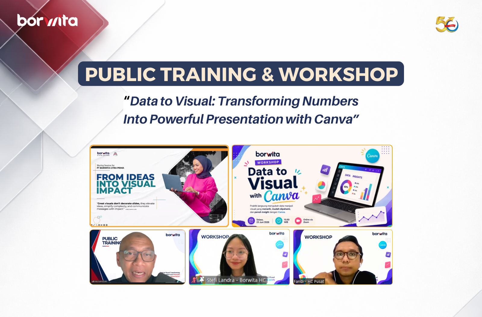
To strengthen these capabilities among employees, Borwita organized a learning series titled “Data to Visual”, consisting of two complementary development programs.
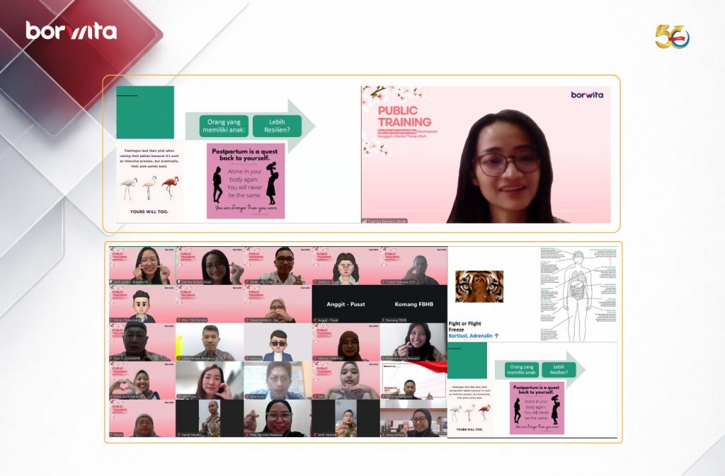
The first session, Public Training: Data to Visual – Transforming Numbers into Powerful Presentation, was delivered in collaboration with Melukis Slide. Participants learned the fundamental principles of data visualization, including how to transform raw data into compelling infographics, charts, and presentation slides. The training also covered selecting the right visualization based on data characteristics, applying visual design principles, and communicating insights more effectively through presentations.

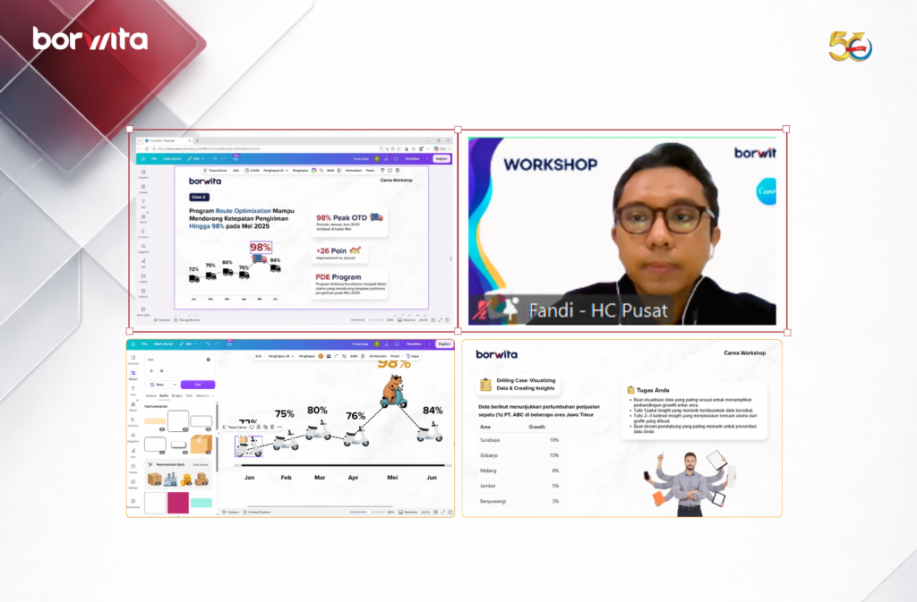
Building on these concepts, Borwita continued the learning journey with a practical Workshop: Data to Visual with Canva. This hands-on session focused on applying the concepts directly using Canva. Participants practiced designing various chart types, selecting effective layouts and color combinations, and developing impactful action titles along with concise supporting descriptions to ensure that every visualization clearly communicates its intended message.
By combining conceptual understanding with practical application, these two learning initiatives are expected to help employees transform raw data into clear, engaging, and actionable visual stories that support more informed business decisions.
Through continuous learning initiatives like these, Borwita remains committed to fostering a culture of growth and equipping its people with future-ready skills that enable them to adapt, collaborate, and create greater value for the business.